Data Science Case Studies
Forecasting, evaluation, applied ML, and decision-support tooling built for messy real-world constraints.
This section covers the work where modeling and product meet: forecast quality systems, localization logic, tokenomics simulations, experimentation analysis, and interactive tools that help people think more clearly about probability and operational risk.
World of Warships Ship Drop Simulator - A Fan-Made Probability Tool
An unofficial decision-support tool that turns drop-rate assumptions and pity rules into clear probability curves, expected values, and collection odds.
Read full case study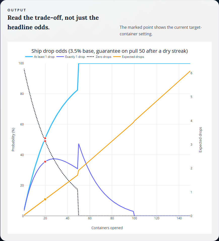
Localization Is Not Translation - Context Cartridges for International Football
A localization pattern that keeps generated sports content culturally native without letting the model invent the wrong teams, references, or tone.
Read full case study
Beyond WAPE - Building a Forecast Quality Framework
A pragmatic evaluation system for deciding whether a model is safe to ship, not just numerically impressive.
Read full case study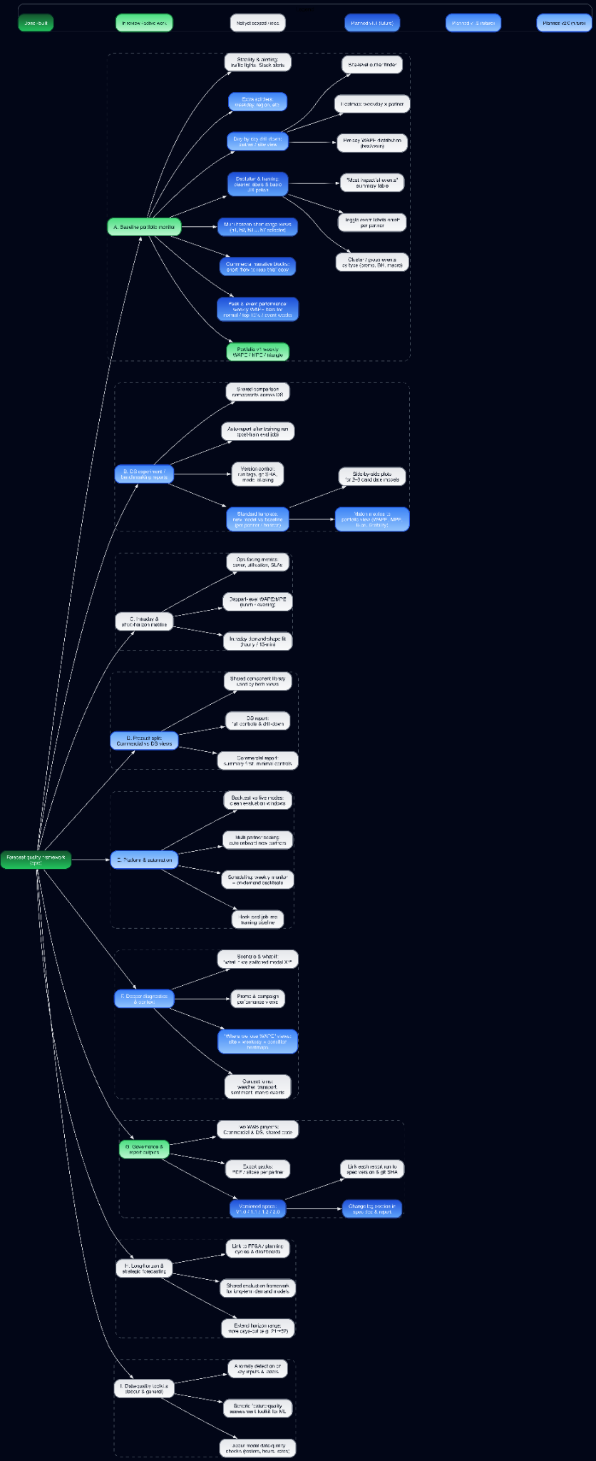
Post-Launch Lessons: Debugging Smart-Contract Rewards and the Year-1 Data Roadmap
What the first launch cycle exposed about reward bugs, reporting gaps, and the data roadmap needed to keep the system legible.
Read full case study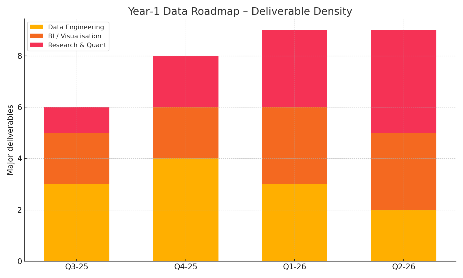
Slash and Secure - Designing Oracle-Node Penalties
A penalty-design exercise balancing operator incentives, fault tolerance, and the need to keep bad behavior economically unattractive.
Read full case study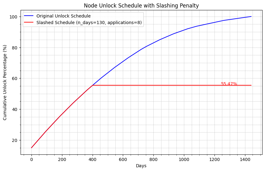
Investor Unlock Schedules in Python - Nine Scenario Simulation
A scenario simulator built to show how unlock design changes sell pressure, allocation dynamics, and governance conversations.
Read full case study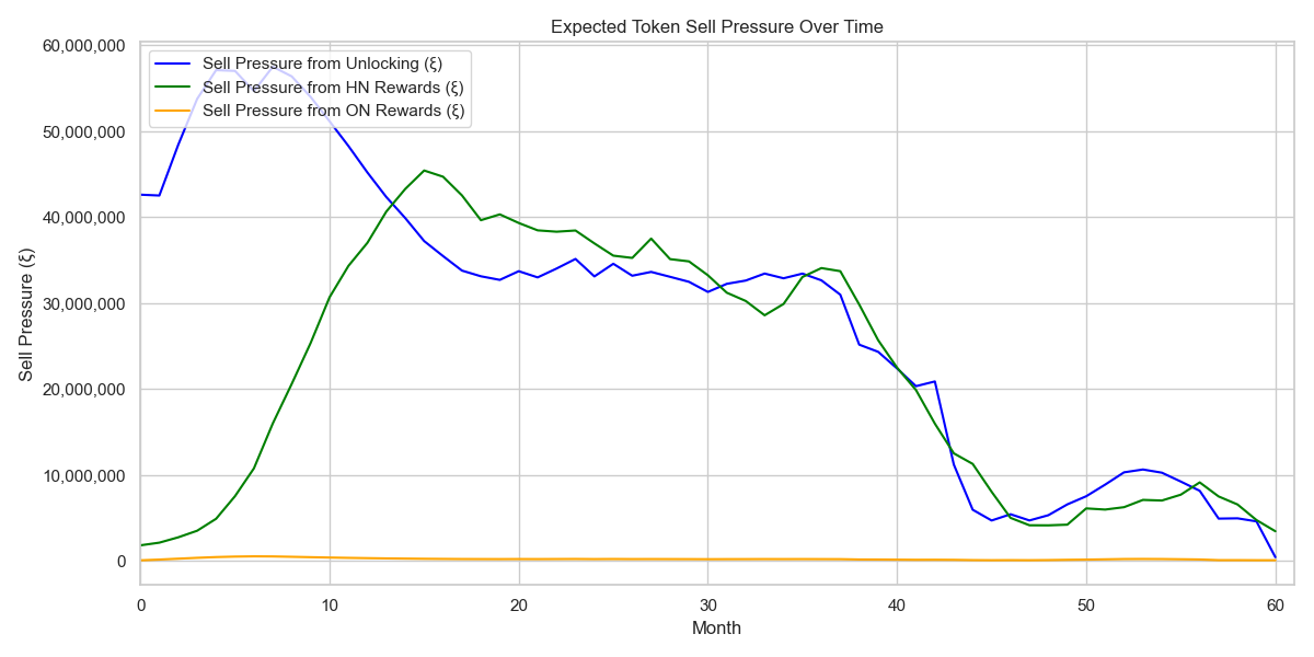
Unraveling the Impact of Chart Positioning on App Sales
A mixed econometrics and feature-importance study on how app rankings, impressions, and sales actually interact.
Read full case study
Advanced Forecasting with Prophet
A practical forecasting workflow for turning messy game-sales data into explainable predictions without building a bespoke model stack from scratch.
Read full case study