Data Analytics Case Studies
Dashboards, KPI systems, and decision support designed for operators, founders, and investors.
These projects are about turning data into choices that someone can actually make: narrative interfaces, KPI definitions, reward dashboards, market analyses, and analytics patterns that reduce ambiguity instead of producing one more chart.
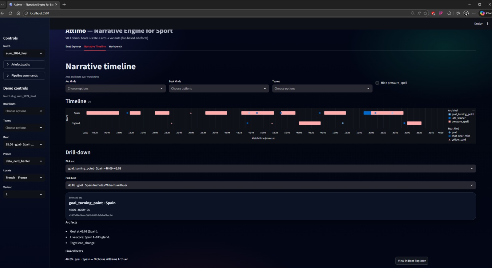
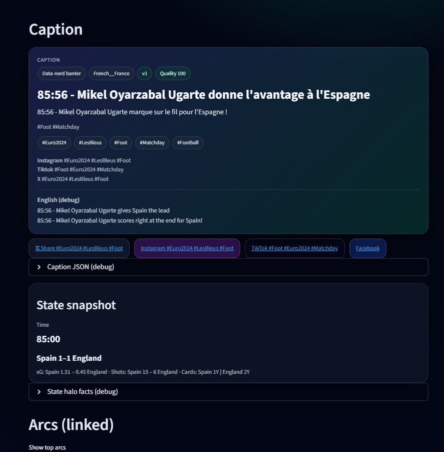
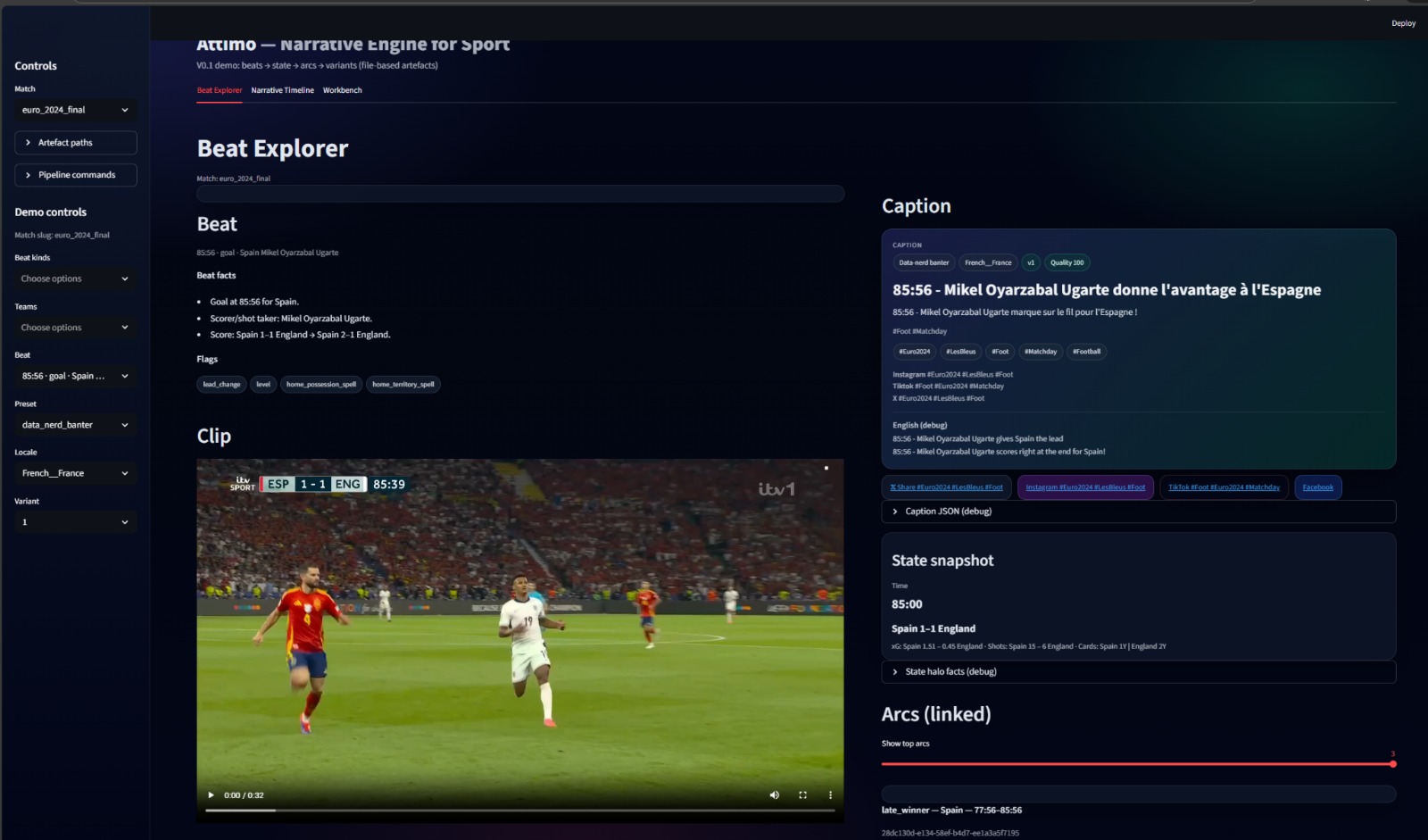
Attimo V0.1 - A Narrative Dashboard for Live Sport
Turning raw match events into auditable story objects, QA cues, and locale-aware outputs for editorial and product teams.
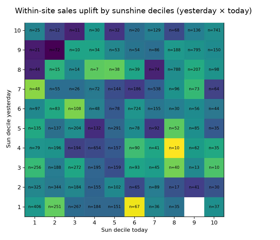
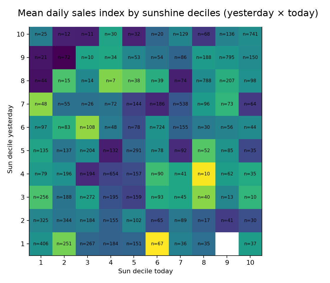
Sunshine Features - Rapid EDA for Feature Viability
A quick but disciplined analytics pass that answered whether weather was worth modeling or just another expensive distraction.
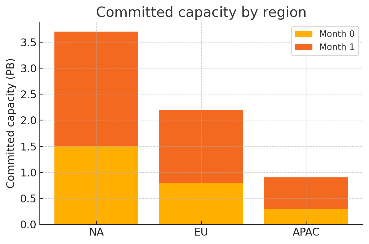
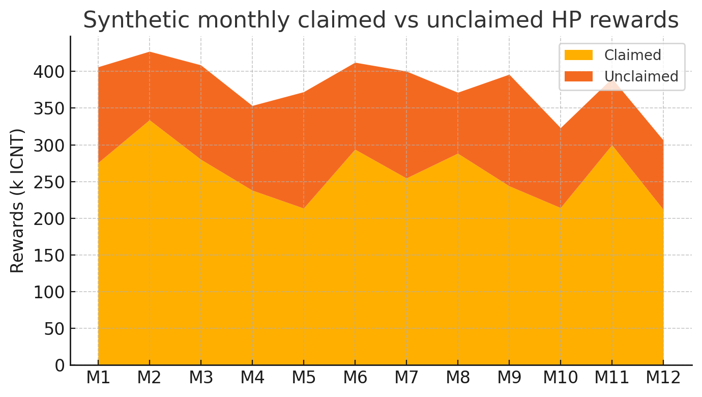
On-chain Rewards - From Solidity Calls to Tableau
A hybrid analytics pipeline combining live contract reads, market data, and capacity data into one reporting layer.
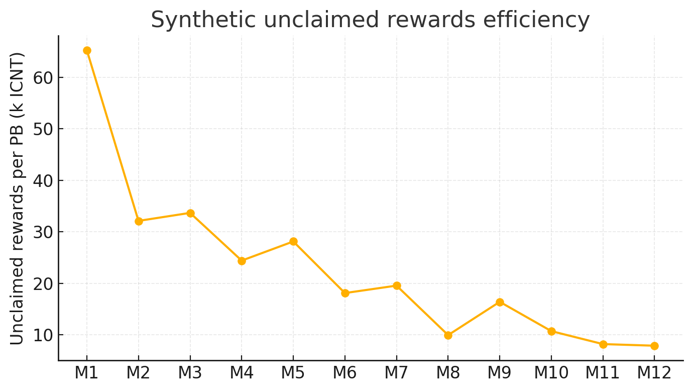
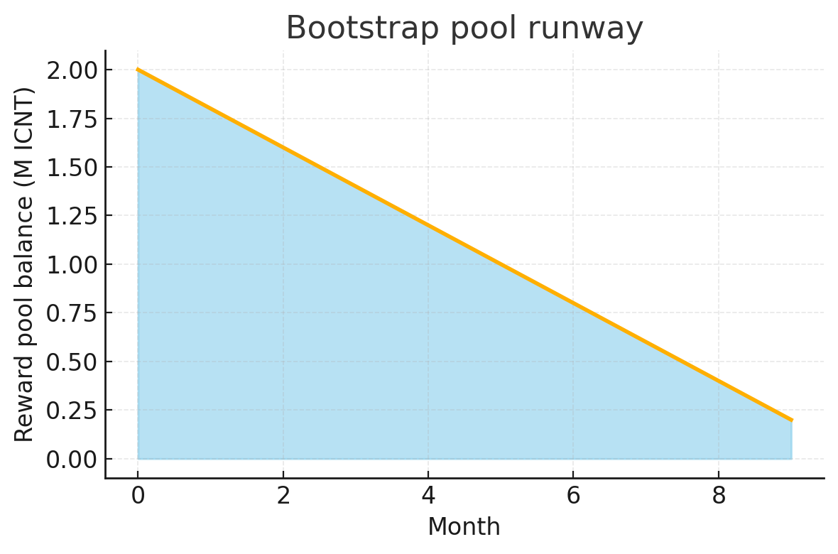
Bootstrap Pool - Jump-starting Hardware Capacity with Liquidity Incentives
Modeling the runway, uptake, and economic shape of a liquidity-incentive program before it became an expensive experiment.
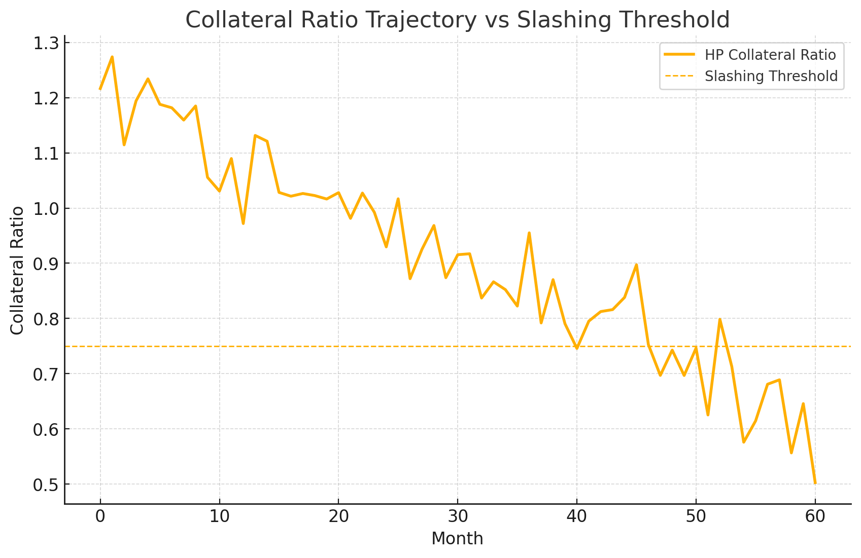
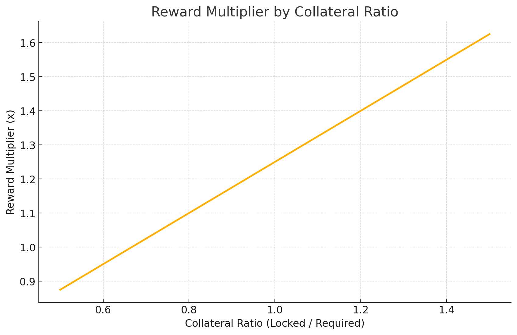
Collateral vs Rewards - Stress-Testing the Economic Levers
Using analytics and simulation outputs together to understand how reward design and collateral requirements pulled against each other.
SWOT Analysis of the Gaming Industry
A market-intelligence piece on the gaming sector focused on strategic pressure points, monetization risk, and where the industry still has room to grow.