1. Problem
The white paper described caps and incentives, but it did not answer the board-level questions: what happens if adoption stalls, demand spikes, or emissions stay fixed while capacity changes? We needed a first predictive model, not another static diagram.
2. Approach
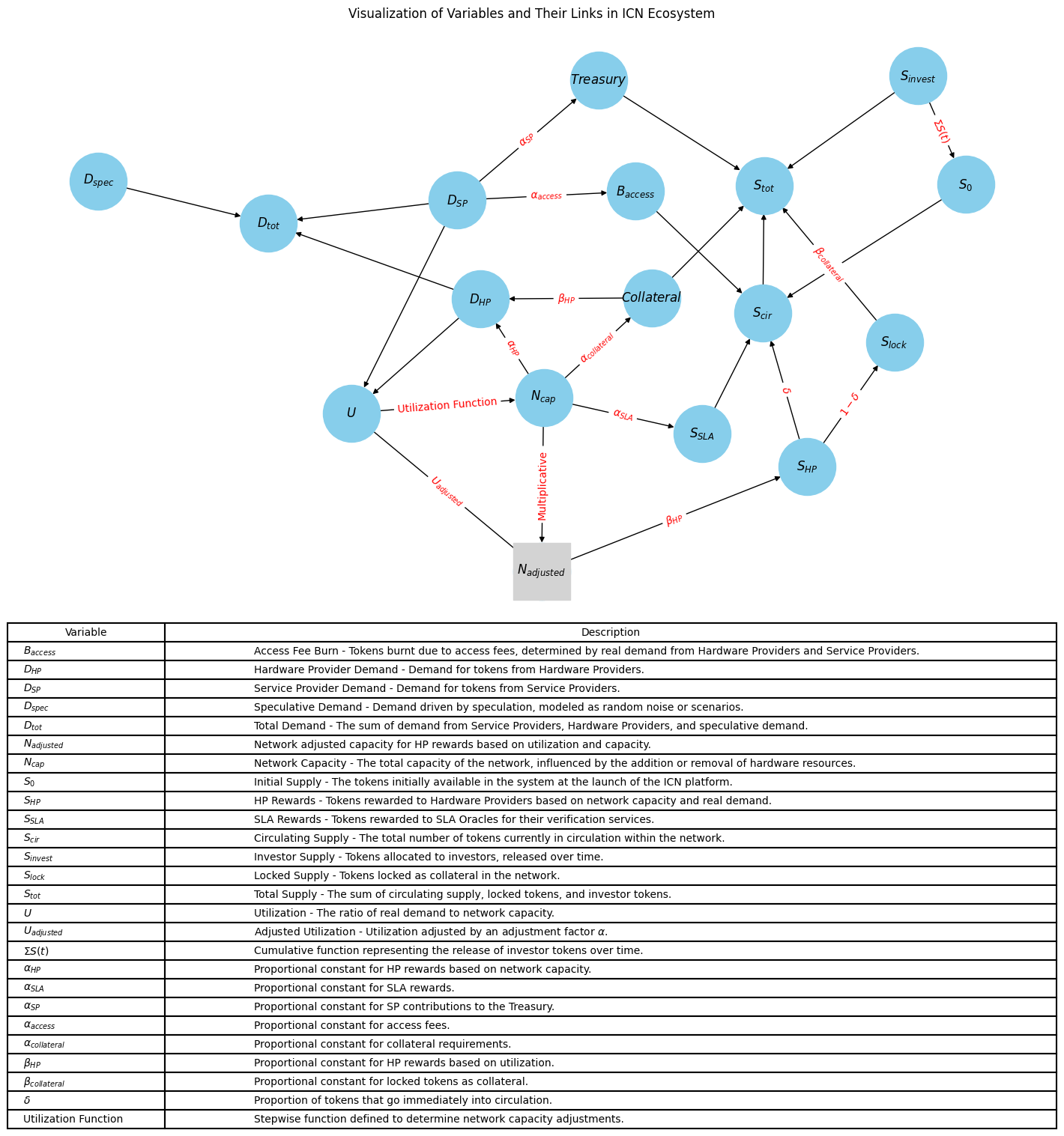
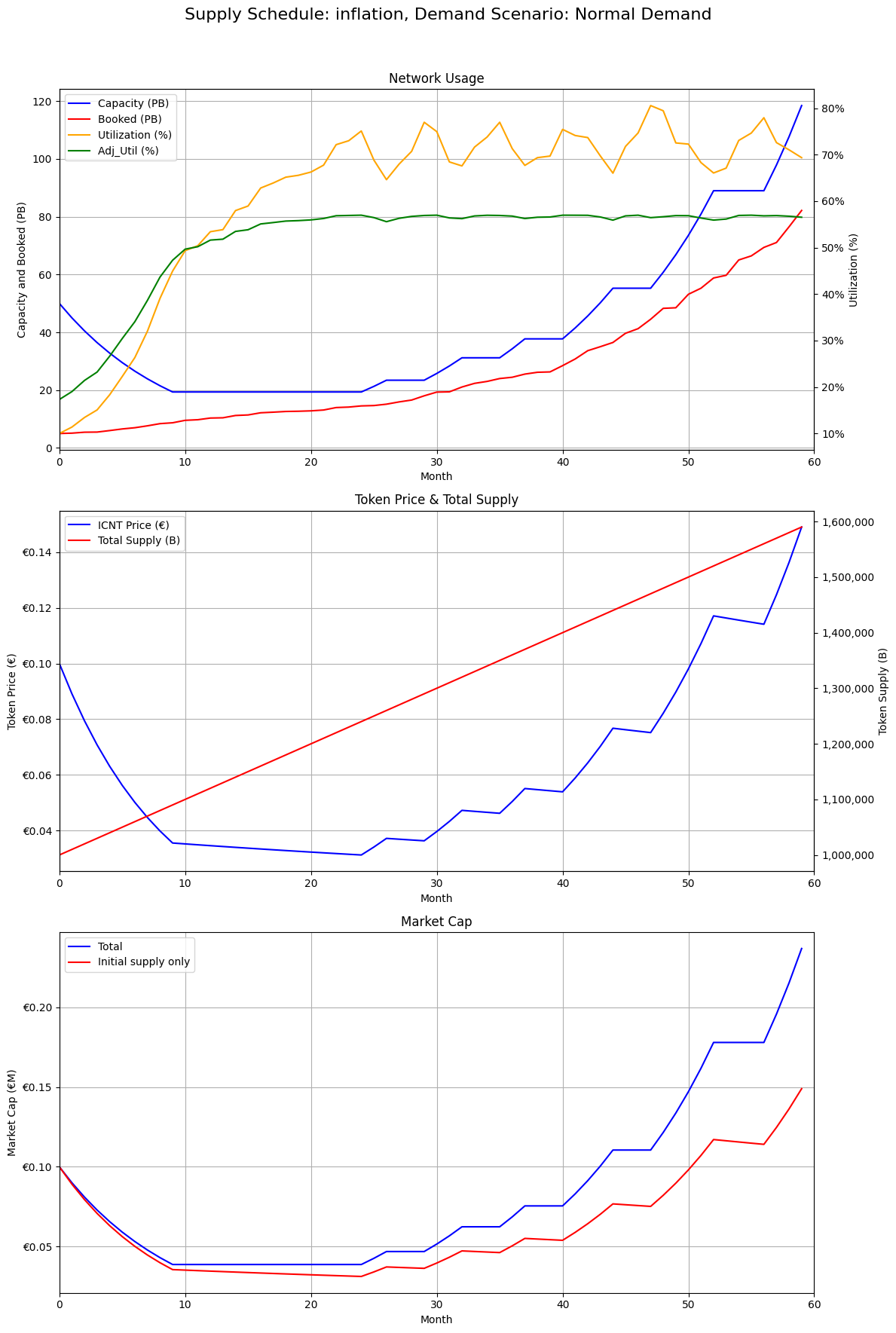
The simulator linked demand curves, emission rules, network capacity, utilization, supply, and price so the team could compare scenarios instead of debating them abstractly.
- Define a simple but explicit variable map.
- Cross demand scenarios with emission-rule variants.
- Inspect the behavior over multi-month horizons rather than one-step outputs.
3. Evidence
4. Outcome
The model provided a first shared simulation surface for emissions and capacity decisions, and it became the basis for later, more detailed stress testing.
5. Tech stack
- Python with NumPy and Pandas
- Matplotlib for scenario views
- Notebook workflows for parameter sweeps and comparison
6. Useful links
7. Related reading
8. Call to action
If your product or network design still depends on hand-wavy assumptions about supply, demand, or utilization, I can help turn it into a model people can interrogate.