1. Problem
Weather features look appealing because they feel intuitive, but intuition is not a good enough reason to increase pipeline complexity. The real question was whether sunshine carried enough signal to justify modeling effort.
2. Approach
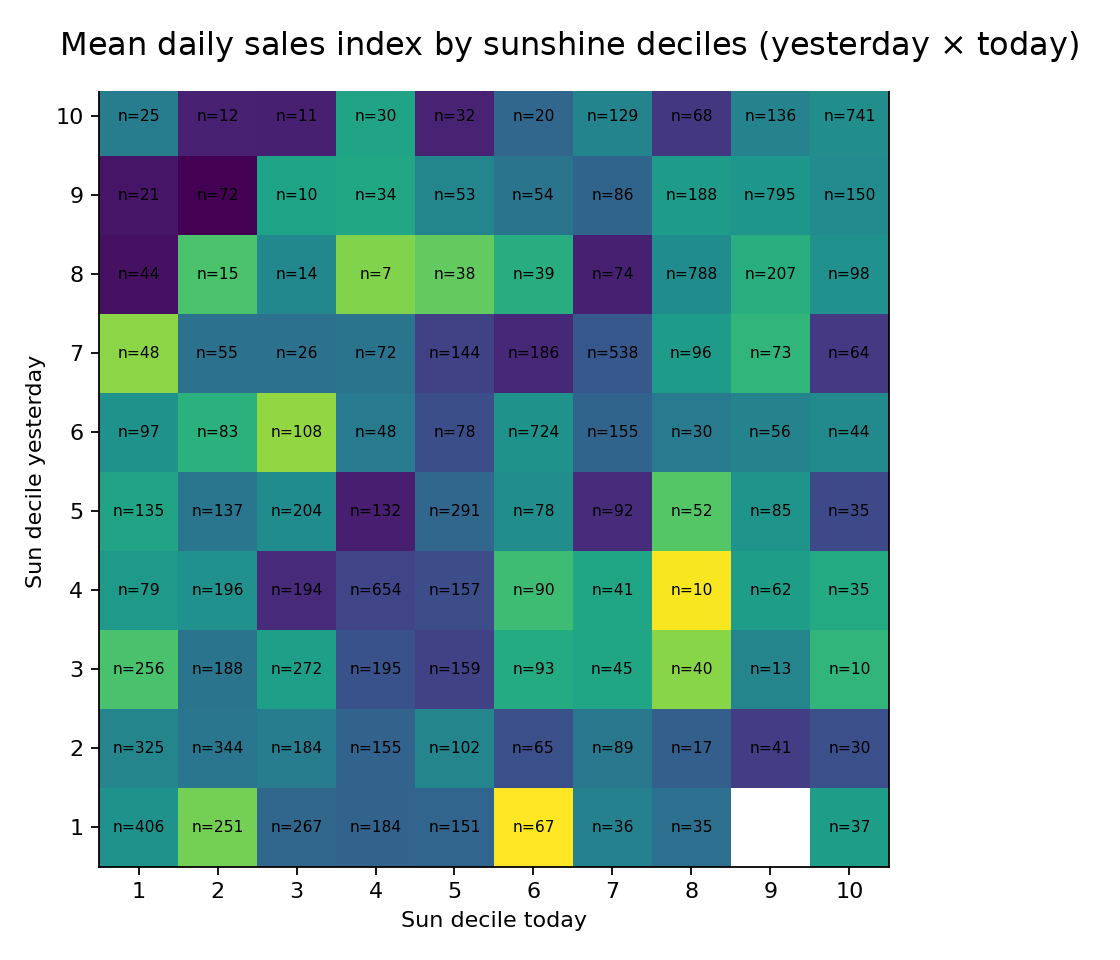
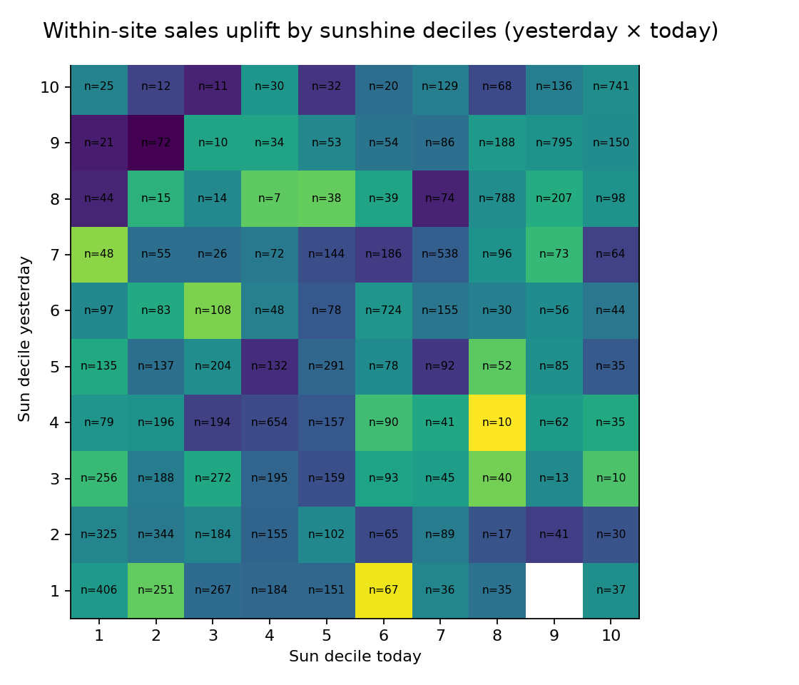
I ran a quick exploratory pass that prioritized data quality, interaction effects, and sample-size visibility over fancy modeling. The aim was to decide whether the feature was worth a proper sprint.
- Check coverage and join integrity first.
- Use deciles and interaction grids instead of naive linear relationships.
- Measure uplift within sites to avoid mistaking geography for signal.
3. Evidence
4. Outcome
The analysis did its job: it stopped the team from overcommitting to a pretty idea before the feature had earned the operational cost of proper integration.
5. Tech stack
- Pandas and NumPy for fast slicing and aggregation
- Matplotlib for decision-grade visualizations
- Reusable EDA helpers for coverage and interaction checks
6. Useful links
7. Related reading
8. Call to action
If you need to decide whether a feature idea deserves proper modeling work, I can help design the fast analytics pass that answers the question cleanly.